

Building the Failed Transfer Experience: From Uncertainty to Clarity
Reimagining the failed transaction journey with clearer status updates, transparent refund timelines, and actionable next steps.

Recently, a frustrating money-transfer experience revealed a critical flaw in many digital banking apps. When a transaction failed, users were often left with little more than a simple failure message. Where was their money? Was it still processing, or would it be refunded? And how long would they have to wait? Without clear answers, a failed transfer quickly became a source of uncertainty and anxiety.
This pain point inspired our team, OFNAV, to rethink the failed-transfer experience in Nova Vault. Despite the app's ability to process transactions, we identified a gap in what happened when things went wrong. Transaction status lacked meaningful context, refund expectations were unclear, and users had no way to understand what would happen to their money next.
Team OFNAV investigated the root causes of user uncertainty and redesigned the experience around transparent transaction updates, clear refund timelines, and actionable next steps. Our goal was simple: reduce confusion, restore user confidence, and help people understand the status of their money without worry.
Here, how we transformed a frustrating transaction failure into a clearer, more reassuring experience, starting with the information users needed most...
The Problem: Failed Transfer Leaves Users in Uncertainty
When money transfer fails, users may see simple error message without knowing what happened to their money. Has the amount left their account? Is the transaction still processing? When can they expect refund? Without clear information, users are left guessing whether to wait, retry the transfer, or contact support.
The recovery experience must communicate what happened, what happens next and where the user can check progress.

Think about what this means. A businessman transfers money for an important payment. But the transaction fails, and his balance changes. With no clear explanation of where his money is, when it will be refunded, or what he should do next, every unanswered question adds to his worry and uncertainty.

What We Found: Users Saw the Failure, but Not What Happened Next
When we examined old transaction experience, some problems stood out. Users were notified when a transfer failed, but the information they needed was missing. They couldn't understand where their money was, when they would receive refund, or what to do next.
Unclear Transaction Status
Users see a failure message but cannot understand what happened to their transfer.
Uncertain Money Location
Users cannot tell whether their money is still processing, or is awaiting a refund.
Missing Refund Timeline
Users have no clear estimate of when their money will be returned.
No Clear Next Steps
Users are left unsure whether to wait, retry the transfer, or contact customer support.
Now Look at It From the User’s Side. This Is What They Felt:
Anxiety over a failed transfer.
Frustration from missing explanations.
Doubt about where their money was.
Uncertainty about what to do next.

Information Architecture
The system maintains a seamless connection across every stage of a transaction—from review and processing to failure and recovery. Critical details like the amount, account, and reference numbers remain visible throughout the journey, while integrated features such as refund tracking, automated support, and final receipts ensure users always understand what happened and what to expect next.
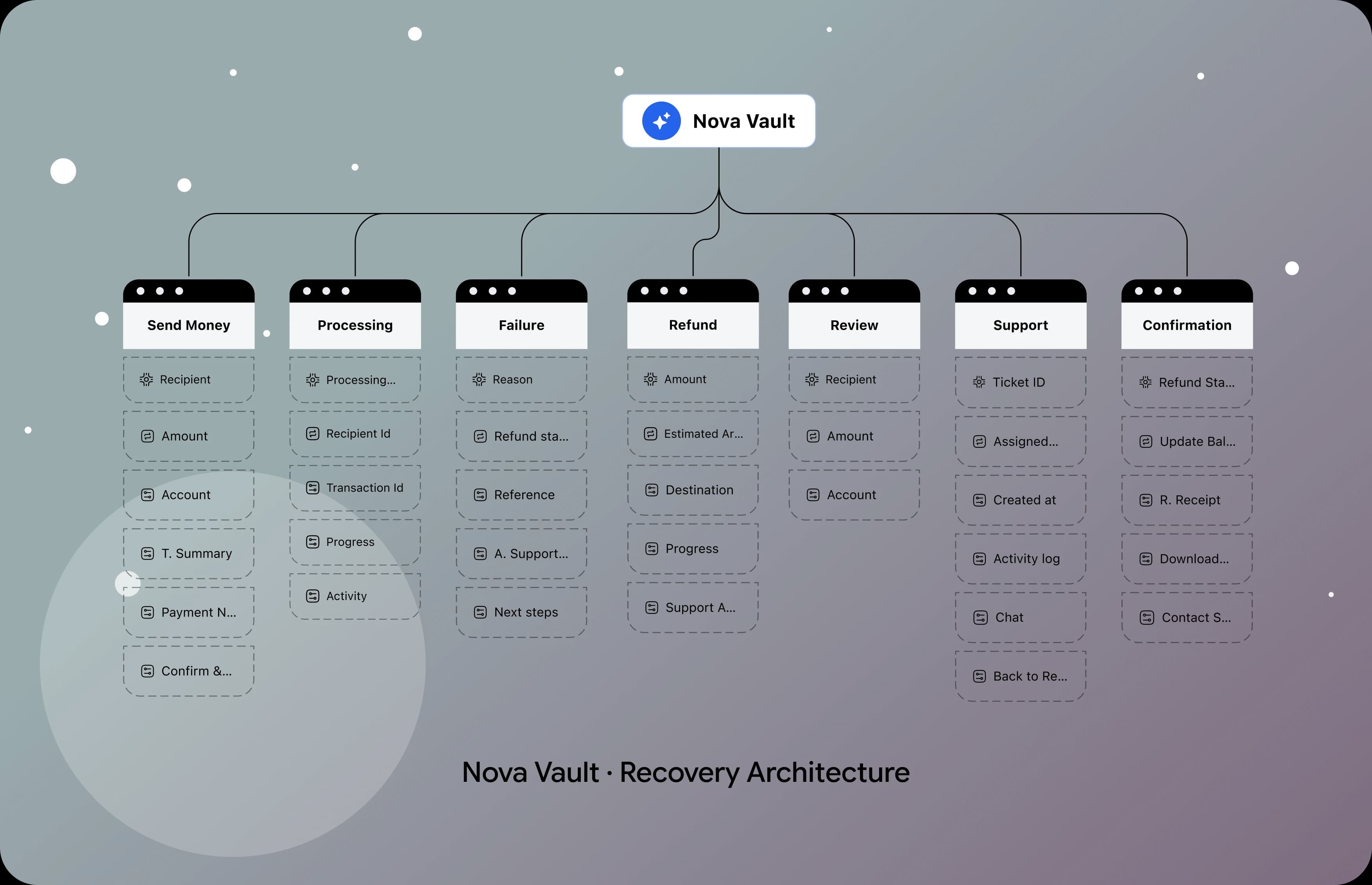
A Small Design System Built for Clearer Transaction Recovery
A reassuring payment experience starts with clarity. And clarity doesn’t happen by accident. So we built a focused design system to help users understand failed transfers, track refund progress, and know what happens next with confidence.

Four Transfer Problems, Four UX Design Solutions
The failed-transfer experience is built around one principle: users should never have to guess what happened to their money. Four design solutions connect transaction status, money tracking, refund expectations, and recovery guidance—helping users move from uncertainty to clarity.
Problem: Unclear Transaction Status
When a transfer fails, users receive a failure message without enough context to understand what happened or what the current status means.
Solution: Clear Transaction Status
We redesigned the transaction status screen to explain why a transfer failed and clearly communicate its current state, helping users to understand what happened at a glance.
Problem: Uncertainty About Where the Money Is
Users cannot easily tell whether their money was deducted, is still processing, or is awaiting a refund, creating anxiety about the safety of their funds.
Solution: Transparent Money Tracking
We introduced clearer transaction details that explain the movement and current state of the money, helping users to understand whether their funds are processing or being returned.
Problem: Missing Refund Timelines
Without an estimated refund timeframe, users are left wondering when their money will return and whether they need to take further action.
Solution: Clear Refund Expectations
We designed a much clearer refund experience by showing the exact return timeline and step-by-step progress. This way, users always know when to expect their money and what is happening behind the scenes.
Problem: No Clear Recovery Guidance
After failed transfer, users may not know whether to wait, retry the transaction, or contact customer support.
Solution: Actionable Next Steps
We introduced clear recovery guidance that helps users to understand what action to take based on the transaction status, reducing guesswork and making the next step easier to follow.
The Failed-Transfer Journey: From Uncertainty to Clarity
We mapped out the entire failed-transfer process to make every step clear and reassuring. From checking transaction status to tracking refunds and choosing what to do next, each stage keeps users fully informed, removes confusion, and restores confidence in their money.
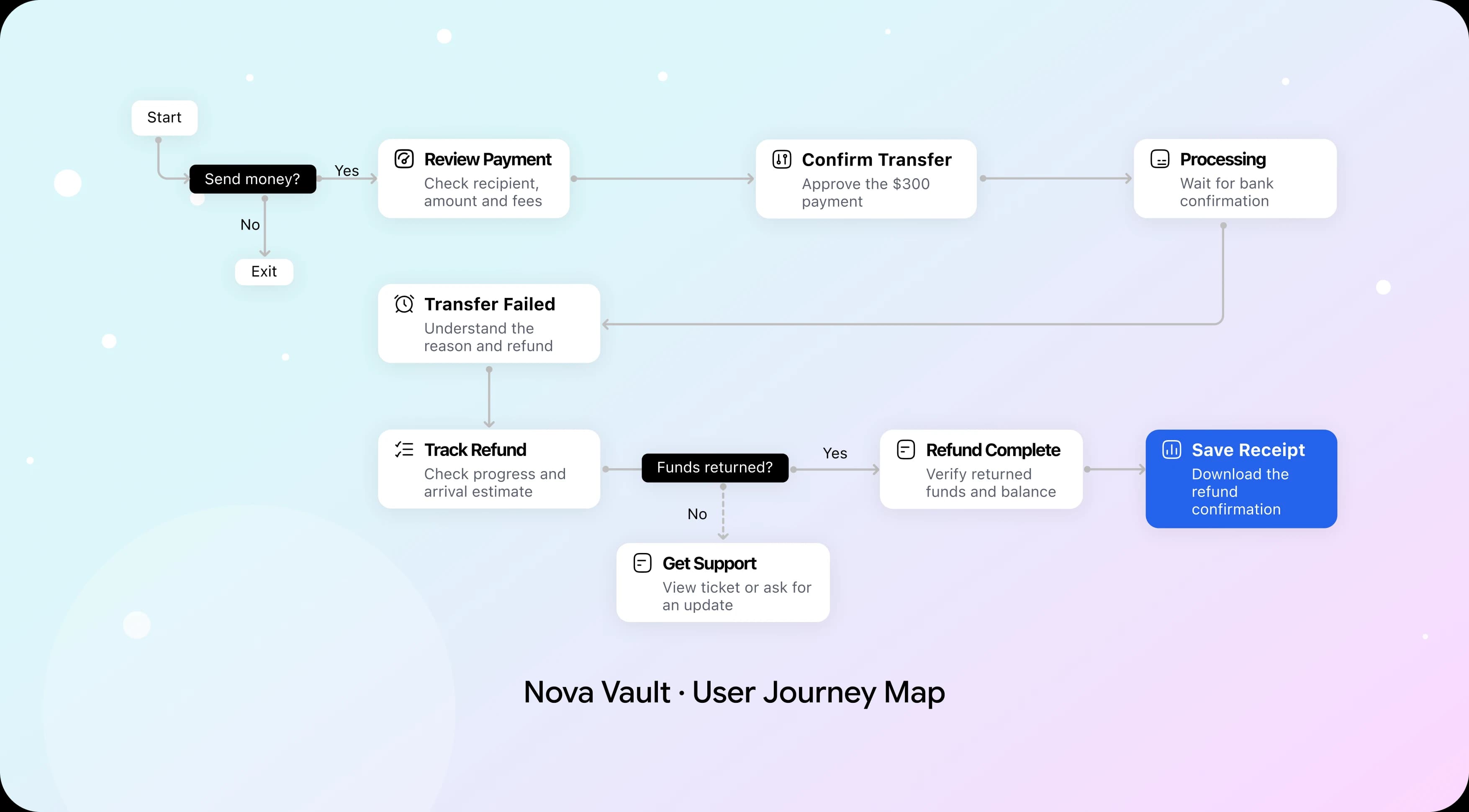
From Wireframes to High-Fidelity Screens
We designed this in two main phases. First, we focused on making the failed-transfer process simple to understand. Next, we polished the UI visuals so every status update, refund detail, and next action felt clear and reassuring.
Low-Fidelity Wireframes
The wireframes had no colors or polished visuals. Their purpose was simple: does the information flow make sense? We established the screen structure, prioritized transaction status, organized refund details, and placed key actions where users could find them without confusion.

High-Fidelity Designs
Once the failed-transfer journey was mapped and the design system was ready, we moved to the final screens. We designed clearer experience to help users to know transaction failure, track money, and know when to expect refund.
One thing stays consistent across the experience: transaction status, refund timelines, and recovery actions are organized into clear, structured interface. This helps users understand what happened to their money and what to do next without unnecessary worry.
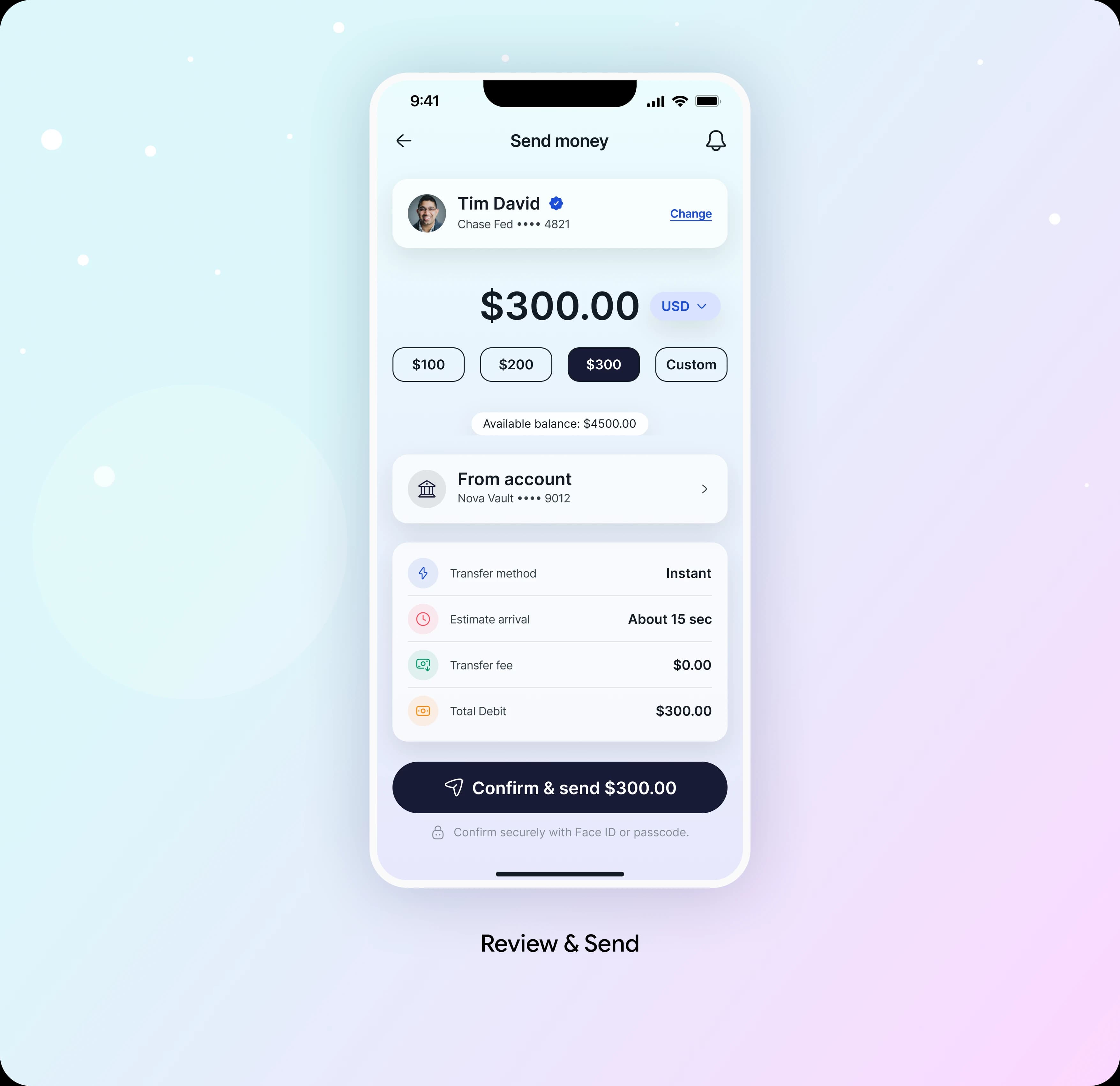
Send Money: Review Before Committing
The review screen presents the recipient, source account, amount, transfer fee and total debit before confirmation. The primary action repeats the $300 amount, and the security prompt explains how the sender confirms the transfer.
Design Decision:
We keep all payment details on one screen so users can double-check everything before sending money. We show arrival times as estimates and require a clear confirmation step to complete the transfer.
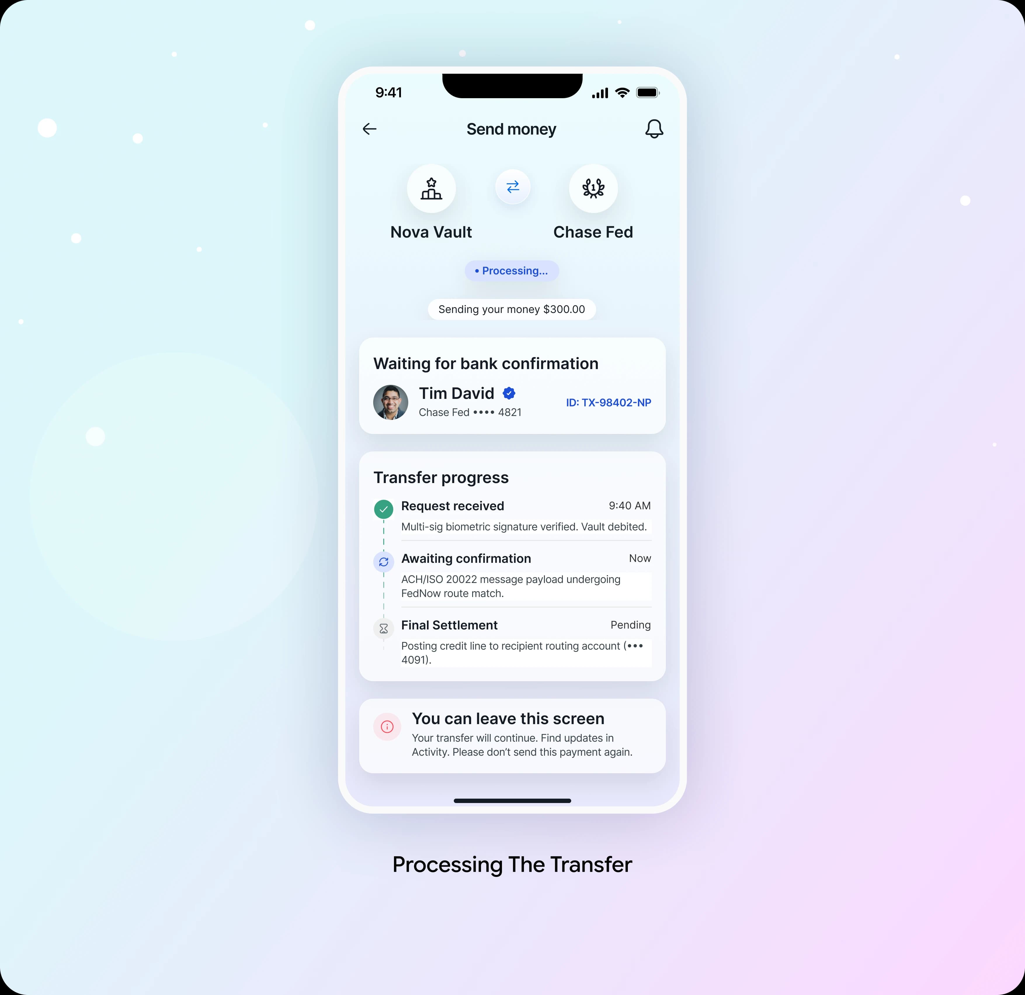
Processing: Explain the Wait
After confirmation, a timeline shows that the request was received and that bank confirmation is pending. Users can leave the screen and check Activity rather than keeping the app open.
Design Decision:
We show a clear, ongoing status update so users don't try sending money twice. We also explain what is happening in simple terms, saving the complex technical details for support logs behind the scenes.

Failure: Explain What Happens Next
The failure screen explains that the recipient’s bank did not accept the transfer and that the $300 return has started. Refund tracking and the linked support ticket are available from the same screen.
Design Decision:
Reassure users by clearly showing their current status and what happens next. Make a distinct difference between "refund started" and "refund complete," and never make promises you can't guarantee about exact payout times.
Refund Tracker: Make Progress Visible
The tracker keeps the returned amount, destination and progress stages visible. Users can see whether the refund is initiated, processing or deposited.
Design Decision:
Break down the status updates into clear, step-by-step events with labeled time estimates. If an update is delayed or unavailable, explain it simply so users aren't left guessing or assuming their money has already settled.

Support Ticket: Preserve the Context
A linked ticket shows the support owner, creation time and refund activity. The user can follow progress or ask a question without submitting the same payment details again.
Design Decision:
Make support ownership visible and keep help reachable. Automation reduces repeated entry, while the chat action gives users a route to human assistance.

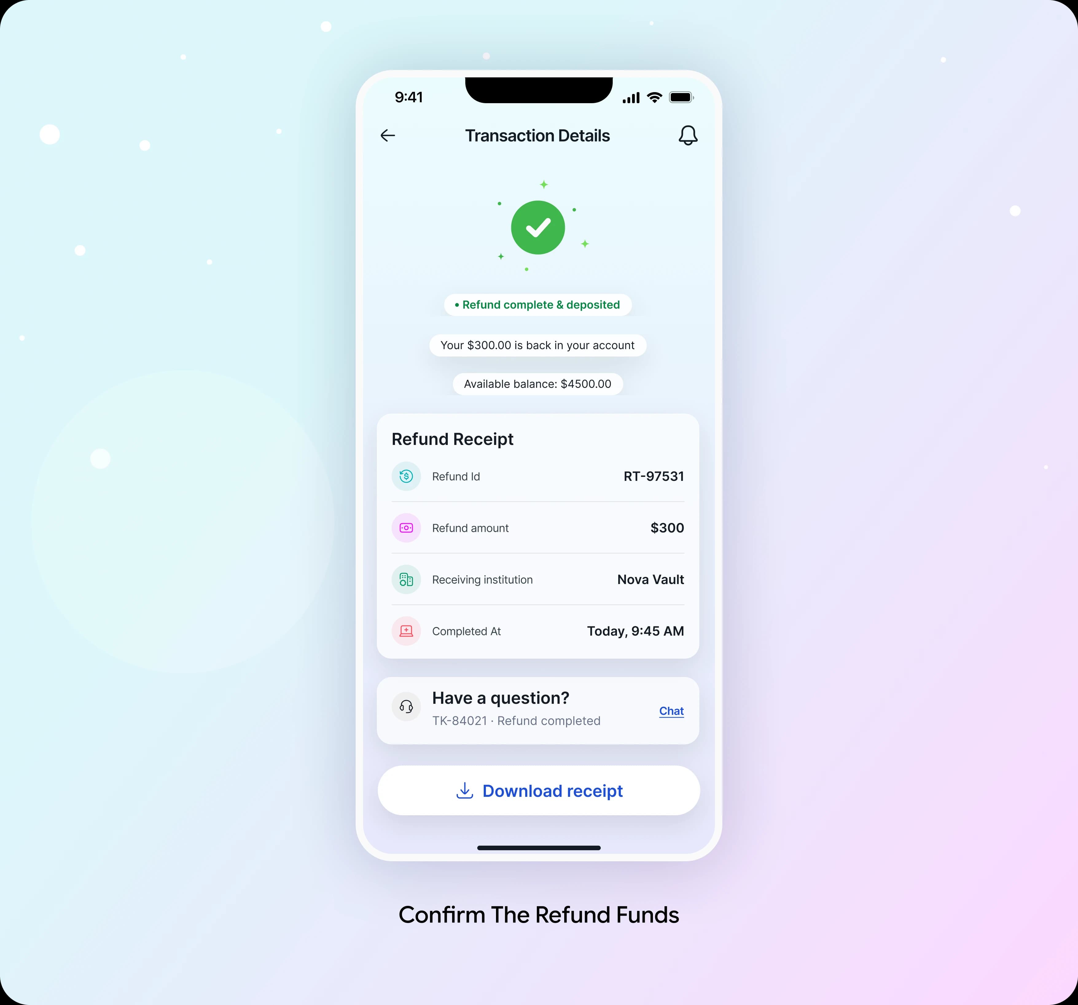
Refund Complete: Close the Loop
The final screen confirms that $300 has returned, displays the receipt and marks the linked ticket resolved. Users can download the record for later reference.
Design Decision:
Show completion only after funds are confirmed available. Align the receipt, balance and support status so the final screen communicates one consistent outcome.
The Results: What Changed After the Redesign
We evaluated the redesigned Nova Vault experience by focusing on transaction clarity, refund transparency, and user confidence during failed transfers.
The remarkable improvement was making unknown feel understandable. Instead of leaving users with failure message, the redesigned experience clarifies what happened to money, explains when to expect refund, and guides toward next step—turning stressful moment into relax experience.

The User Experience Speaks for Itself

What to Explore Next
The failed-transfer uncertainty problem is addressed. Looking ahead, we identified three opportunities to help Nova Vault evolve from clearer transaction recovery into more trustworthy money-transfer system.
V1: Proactive Refund Tracking
Provide real-time refund updates, estimated arrival times, and notifications when refund statuses change. Why users can stay informed without repeatedly checking their transactions.
V2: Intelligent Failure Resolution
Identify common transfer failures and provide context-aware explanations with recommended actions. Why users can resolve issues faster instead of guessing what went wrong.
V3: Predictive Transaction Protection
Detect potential transfer issues before completion and offer preventive guidance when appropriate. Why Nova Vault can help users avoid preventable failures rather than only explaining them afterward.
What This Project Taught Us
Four lessons we will carry into every financial product design:
Clarity Comes Before Reassurance
Users feel more confident when they understand what happened to their money and why transfer failed.
Show Where the Money Is
Clear transaction states help users understand whether their funds are processing, deducted, or being refunded.
Make Waiting More Predictable
Transparent refund timelines replace uncertainty with clear expectations about when money should return.
Guide Users Toward the Next Step
Actionable guidance helps users know whether to wait, retry, or contact support without unnecessary confusion.
What we valued most about this project was turning stressful financial moment into clearer, more reassuring experience—helping users understand their money, trust the process, and move forward with confidence.
Special Note:
This case study is based on a real client engagement. Certain identifying details have been omitted due to confidentiality requirements.
Thanks For Reading
Explore More Client Transformations
Solving Data Quality Issues in CRM for High-Growth Teams
View Details
Beyond Confident Answers: Building a Trustworthy AI Agent
View Details